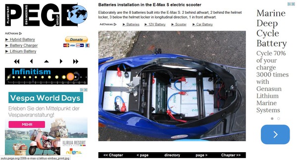
Google threatens with the devaluation of web pages that are not adapted for cell phones. The same content in 6 different layouts shown.
| Layout for up to 794 pixel width screens, most cell phones
|
| 
|
|
|
The page is zoomed, to show the 600 pixel width content over nearly the total screen width. 15 pixel border, at less than 360 pixel only 4 pixel border.
|
| SVGA and most tablets in portrait mode
|
| 
|
|
|
From 795 to 999 pixel width, it is possible to show both 160 pixel width ads richt from the 600 pixel width content.
|
| XVGA and screens from 1000 to 1200 pixel width
|
| 
|
|
|
Now, the navigation has place left from the 600 pixel width content. Both 160 pixel width ads move below the navigation.
|
| Layout for full HD and 1880 to 2279 pixel width
|
| 
|
|
|
The whole content is in 2 columns. So there is less to scroll on a full-HD screen.
|
| Layout for very large screens, 2280 pixel and more width
|
| 
|
|
|
The only difference to the full-HD layout: the block for own ads moves from below the navigation left to an own column right.
|
You can test by the zoom function on the browser the different representations. With the zoom function all screen-shoots of the following pages have been created.


